|
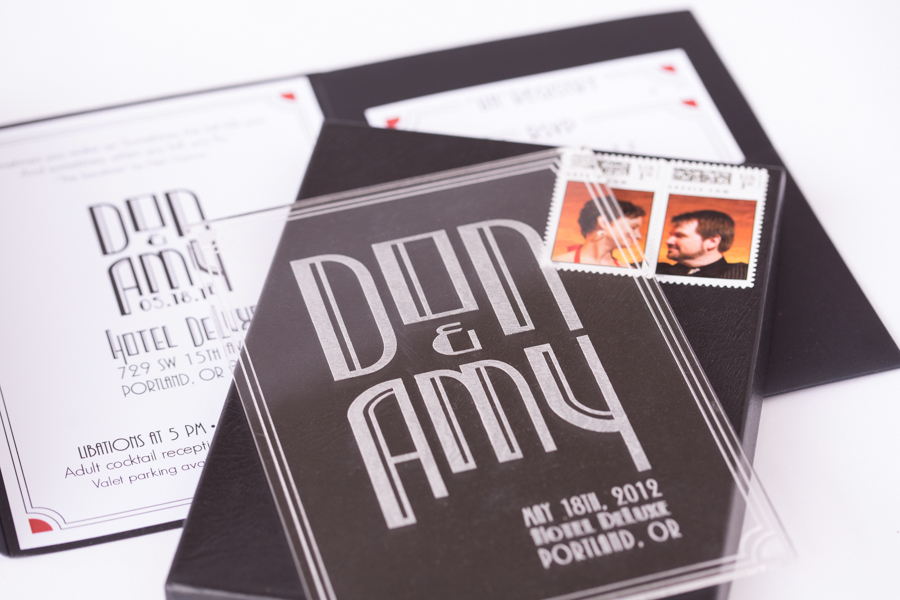
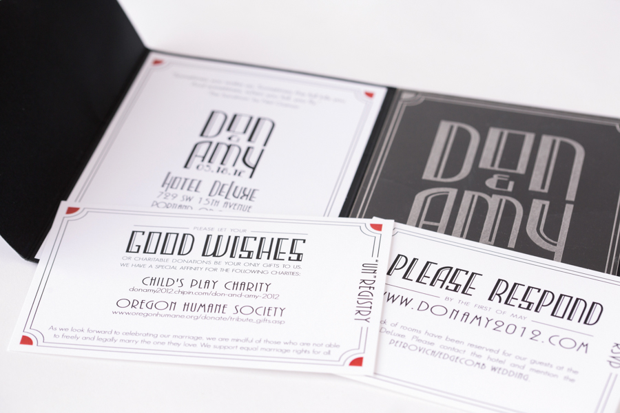
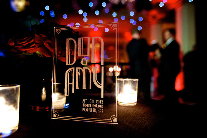
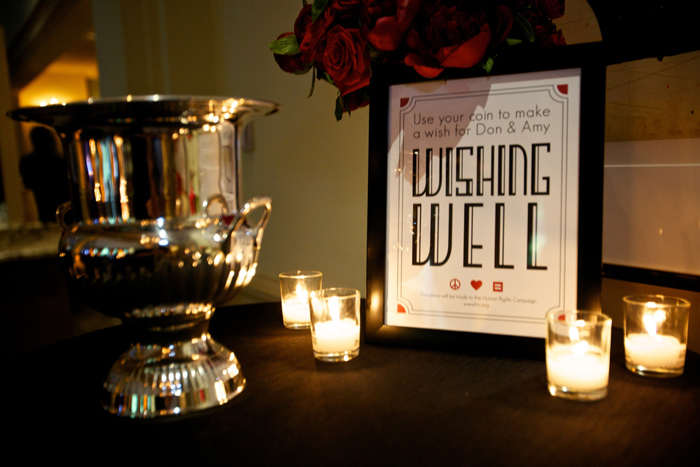
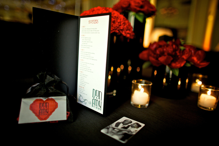
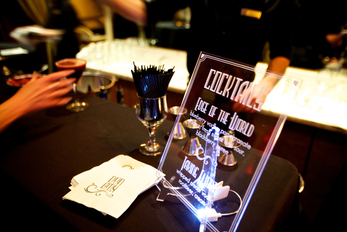
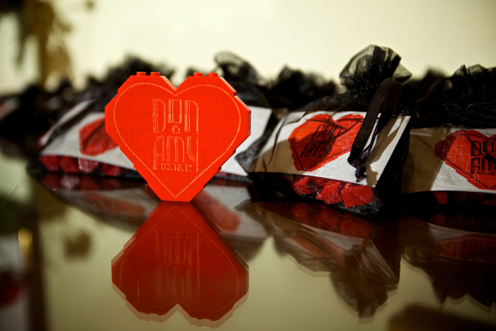
Oh, where do I begin with these two? From our first meeting I just knew this wedding would be killer. They said all the right things to make me swoon: Hotel de Luxe, art deco, black + white + red color palette, custom logo, and my all-time favorite– clear acrylic! I had such a good time working with them and their awesome wedding coordinator, Mandi from Champagne. Here are a few shots of their invitation (by Paul Rich) and other goodies by their photographer Craig Mitchelldyer. See more from Craig here, and Champagne's blog post with even more photos.
5 Comments
9/23/2013 03:06:23 pm
Your art is incredible i loved so much keep sharing and posting.
Reply
10/22/2013 09:01:47 pm
Amazing. Love these black white and red color palette style invitations. I must say these are perfect invitations for a wonderful wedding.
Reply
4/24/2023 10:01:56 am
First time reading much appreciate it
Reply
Leave a Reply. |
Hi, I'm Lindsay! Thanks for stopping by my blog. Check here often for the latest and greatest coming from the Paper Bloom studio.
Archives
February 2015
Categories
All
|

 RSS Feed